Measuring the Apocalypse
Where we will and won't find meaning in this global pandemic
Ruth Margalit writes from Tel Aviv in the New York Review of Books that “The pandemic feels both futuristic and biblical, eschatological and utterly banal.” This was on March 18, when the global death count was less than half its current number. I know this because, like many people, I am refreshing global death tallies on my phone throughout the day. The repetition isn’t healthy or very useful, but I am nonetheless feeling a compulsion to know what that number means. Around dinnertime yesterday, it climbed over 20,000. There is hardly any point in updating this number for when this Sightings piece goes to press, because in a few more days there will already be several thousand more deaths. When, one day in the future, the world faces its next pandemic, the death toll of COVID-19 will be a largely closed dataset, and the view from late March 2020 will not count for very much at all.

The tension between eschatology and banality defines the current moment for many of us who are both reacquainting ourselves with home in a period of shelter-in-place orders, and facing the reality of being laid off, or of having access to our loved ones in prison or long-term care suddenly shut off. The big numbers of COVID-19 are almost a backdrop, even while they determine most of what we do (and don’t do).
This past week, the American psyche has also seen a shift of the object of our apocalyptic fears from the big numbers of COVID-19 mortality to the big numbers of a market economy in crisis. The President is calling for a “resurrection” of the economy on Easter Sunday. This combination of market panic and an aching desire for getting to the truth of the moment has even led one prominent Christian writer, well known for his critique of modern secularism’s supposed “culture of death,” to conclude with no sense of irony that “there is a demonic side to the sentimentalism of saving lives at any cost,” and on this basis oppose public health measures that threaten our commercial wellbeing. How on earth did we get here?
We are flailing because we need the world to be meaningful, but the fact of a pandemic is not something from which we can easily extract meaning and truth. We are awash with data being updated from a global array of regional and local reporting centers in real time, and the smart visualization of this data often fools us into thinking that we are looking at the meaning of COVID-19. These numbers are one way of seeing the virus, and epidemiologists can interpret the data through computational models that give us a picture of what the pandemic means for human populations right now and in the immediate future. Likewise, economists can interpret the human toll of strained social systems as they are modeled from unemployment claims data. All of this is important for policy decisions, and meaningful in its own way, but the pandemic itself resists our attempts to make sense of it.
Richard Rosengarten suggested in a recent Sightings article that we can find helpful comparisons to our own situation in the Lisbon earthquake of 1755, which quite literally created the genre of theodicy (writings about the problem of evil) in its modern form. Today, I would argue, we are forced not only to reflect upon the problem of evil, but also upon the idea of apocalypse. The 2004 Indian Ocean Tsunami, the 2008 Cyclone Nargis, and the 2010 Haiti earthquake are three apocalypses of the recent past that each dwarf the death toll of the Lisbon earthquake, and the COVID-19 pandemic will enter this class of massive evils.
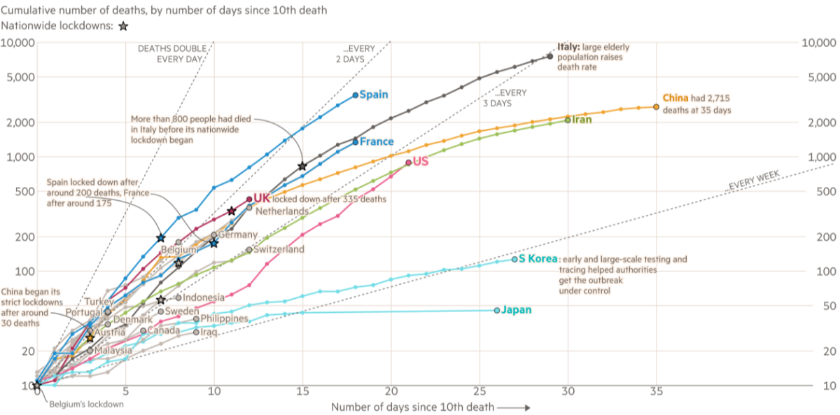
When the numbers are this large and accelerate this quickly—when the human toll of a disaster is best visualized on a logarithmic scale—we run up against what philosophers call the sublime. Immanuel Kant describes the sublime as coming from an inadequacy of the imagination to grapple with great magnitudes. Our natural way to cope with this inadequacy is to start talking in absolutes. We see what looks like an asymptote on the epidemiologist’s graph and understandably, we extrapolate: it is the end of the world.
Another way of seeing the virus sets aside these statistics. We see the images of bruised faces and stories of triaging for ventilator access in the Lombardy region of Italy. Stories of collapse—of individual bodies and of hospital capacities— offer their own interpretation of what a pandemic means. These personal narratives give us a knowledge that is “merely” anecdotal, but they also offer us a glimpse of the truth. We can’t fully understand public health campaigns to “flatten the curve” with a numerical comparison of available ICU beds to hospital intake numbers; most of us only grasp the significance of the gap between these two numbers when we hear stories about their human cost.
This need for images is also why perception of individual, personal losses make an indelible mark on our understanding of large and complex crises. We remember the falling man from 9/11, or Alan Kurdi of the Syrian refugee crisis. In a dataset, these deaths register as: 2. But their meaning extends well beyond their individuality. Likewise, when we read stories about individual strangers in Wuhan, Milan, or New York, or when we live through the struggles of individual loved ones, these things mean something that is genuinely universal.
History suggests that we will inevitably try to measure the apocalypse as we are faced with human crises like the COVID-19 pandemic. If we cannot find meaning in the numbers themselves, we will generate it to cope. This all too human response risks panic and despair when the magnitude of what we face is imagined as absolute. But it also allows us to see more universal truths in individual stories. Often these truths are tragic. Increasingly, they will be ones of recovery, neighborliness, and song. ♦
Sightings is edited by Joel Brown, a PhD Candidate in Religions in the Americas at the Divinity School. Sign up here to receive Sightings via email. You can also follow us on Facebook and Twitter. The views and opinions expressed in this article are those of the author and do not necessarily reflect the position of the Marty Center or its editor.
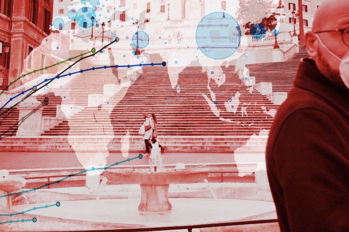
Image: photomontage created by The Financial Times; Chart: data compiled by Johns Hopkins University as of 2:00 p.m. CST on March 25.


